Build your vocabulary without opening an app.
Wordify is a vocabulary learning app for iOS and Android, and a calm, scholarly alternative to Duolingo and Drops. It slips curated vocabulary into your day through passive, ambient widgets and notifications.
- 🇺🇸
- 🇪🇸
- 🇩🇪
- 🇫🇷
- 🇪🇪
- 🇵🇱
- 🇷🇺
Android 7.0+ · iOS 16.1+ · No account required.
Philosophy
The ambient learning method
We believe true mastery requires rhythm, not rush. Wordify is designed around the principles of cognitive ease and retention.
Passive exposure
Learn without logging in. Wordify lives on your home screen, lock screen, and notification shade — gently introducing words into your daily visual environment.
Scientific spacing
Our SM-2 algorithm schedules reviews at optimal intervals, ensuring long-term retention based on established spaced-repetition psychology.
The library
Curated for excellence
A carefully selected vocabulary designed to elevate your everyday language.
The shelf
Everything you need
Smart tools that make vocabulary stick — from passive reminders to active games.
Personal Word Library
Add custom words and organize your vocabulary by topic.
5 Training Modes
Flashcards, Spelling, Word Search, Picture Match, Sentence Builder.
Spaced Repetition
SM-2 algorithm schedules reviews at the right time.
Audio Pronunciation
Hear every word read aloud with device TTS (Premium).
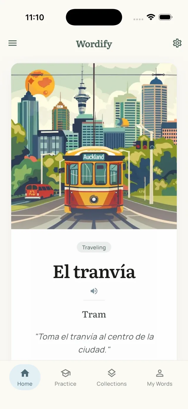
Usage Examples
See words in context with real example sentences.
Streak & Heatmap
Track daily learning with a GitHub-style activity calendar.
Passive Learning
Word always visible in your notification shade — plus widgets.
Auto Word Rotation
Words change automatically — 15min–8hr intervals on Android, WidgetKit timeline on iOS.
Home Screen Widget
Native widgets on Android (3 sizes) and iOS (3 sizes, interactive iOS 17+).
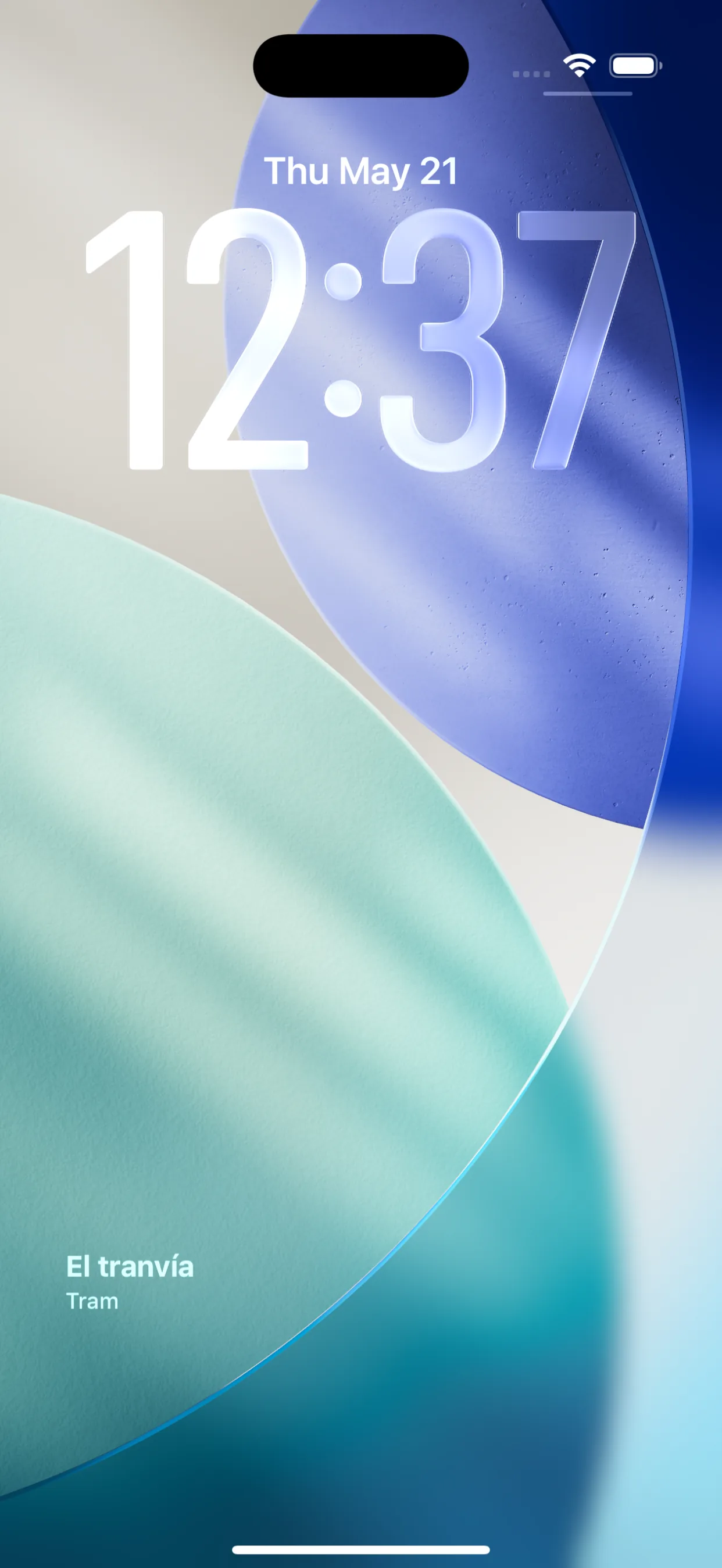
iOS Lock Screen Widget
Word and translation directly on your iPhone lock screen (iOS 16+).
Custom Word Images
Attach images to custom words via Pixabay search, camera, or photo library.
7 Languages
EN, DE, ES, ET, FR, PL, RU — any pair, dynamically.
Works Offline
All features available without internet. No account needed.
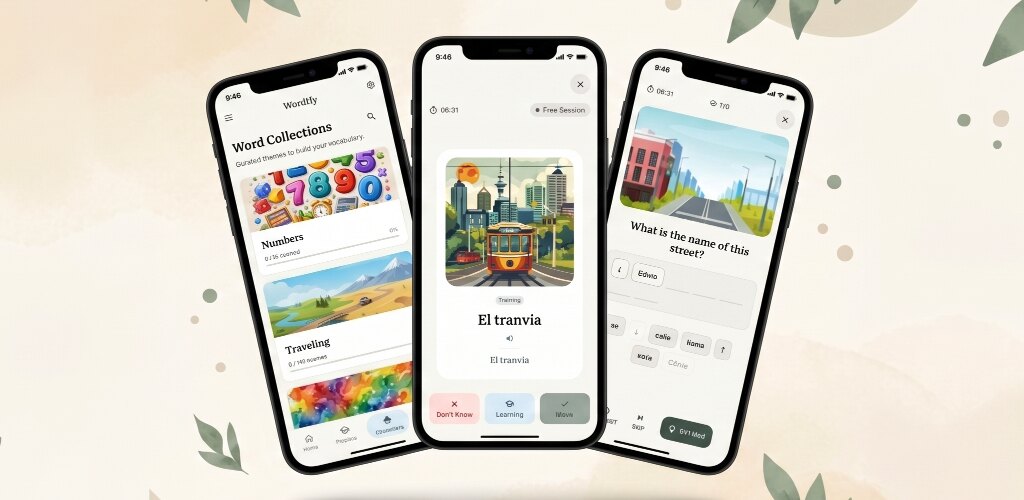
27 Collections
2,289 pre-built words: Home, Sport, Work, Travel, Food, Health, Technology and more.
Global Search
Find any word across all 27 collections — results grouped by collection.
IPA Pronunciation
Every word in 6 languages (EN, ES, FR, DE, PL, RU) ships with phonemic IPA transcription.
The study
Five ways to practise
Different ways to learn mean better retention — pick your style or mix them all.
Flashcards
Classic card-flip learning with SM-2 spaced repetition. Tap to reveal translations and rate your recall.
Spelling
Reconstruct words from scrambled letter tiles. Shake animation keeps you honest.
Word Search
Find hidden words in a letter grid — three difficulty levels from 7×7 to 10×10.
Picture Match
Choose the correct image for each word. Great for visual learners.
Sentence Builder
Rearrange scrambled words to form correct sentences. Builds grammar intuition.
The ledger
Consistency, gently kept.
Track daily streaks and review activity with a 90-day heatmap. Share your progress and keep your chain unbroken.
Last 90 days
73 active days
Current streak
12 days
Passive learning
Learn without trying.
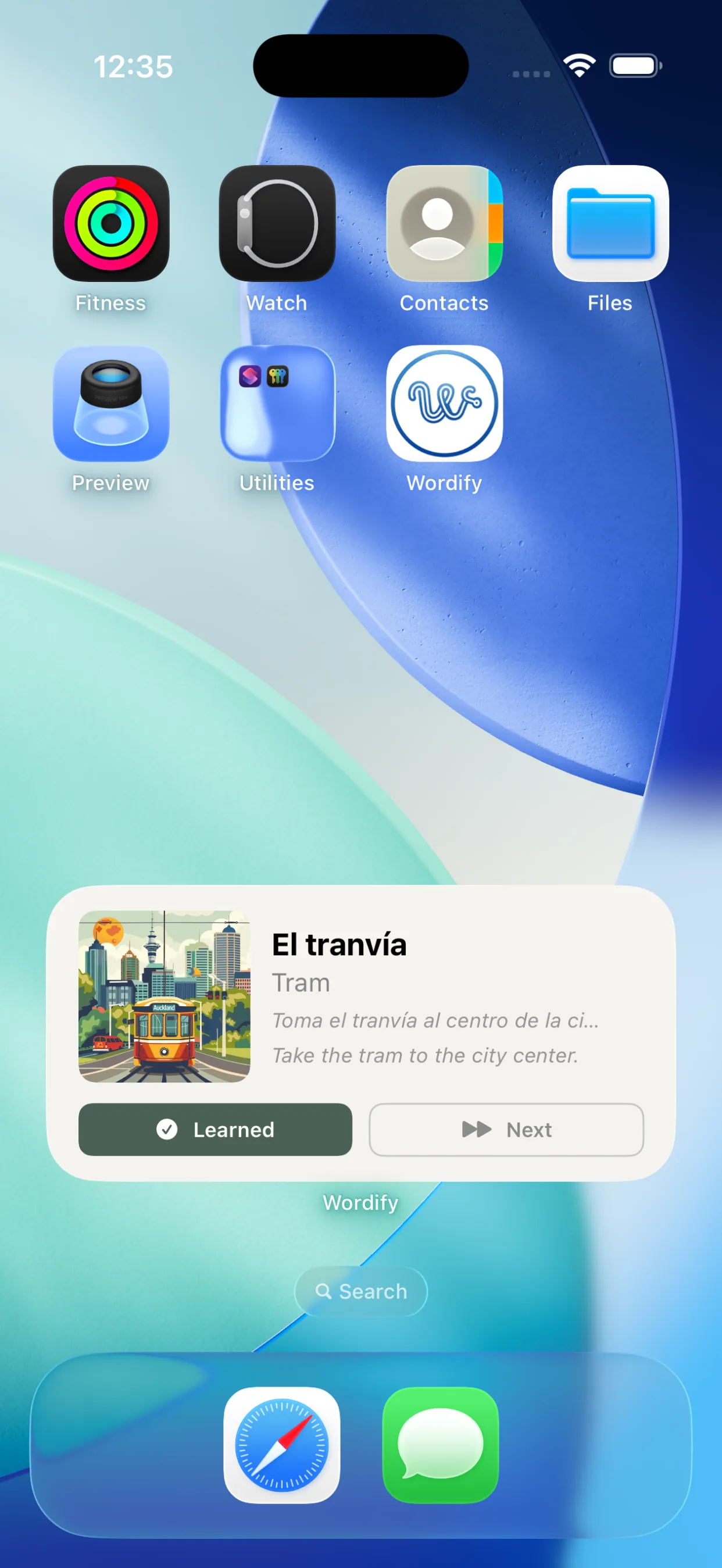
Wordify teaches vocabulary even when you're not using the app — through home screen widgets, lock screen widgets, and notification reminders. Every glance at your phone becomes a learning moment.
- Persistent word notification in notification shade (Android & iOS)
- Home screen widget on Android (3 sizes) and iOS (interactive, iOS 17+)
- iOS lock screen widget — word & translation without unlocking (iOS 16+)
- Mark as learned without opening the app (notification or widget)
- Words rotate automatically on a schedule — every 15 min to 8 hr (Premium)
- Smart daily reminder — only fires when words are actually due
The tariff
Choose your path
Invest in your lexicon with a plan that fits your rhythm.
New users get a 7-day full premium trial on first install.
Yearly
~$2.42/mo · save 31%
7-day free trial · prices vary by region
- Everything in Premium
- Best value vs monthly
- Billed once a year
Monthly
7-day free trial included
Prices may vary by region
- Unlimited words & training
- Audio pronunciation (TTS)
- Auto word rotation (Android & iOS widget)
- Widget "Next Word" button
- Unlimited collection review
Lifetime
- Everything in Premium
- One-time payment, no renewals
- All future updates included
| Feature | Free | Premium |
|---|---|---|
| Custom words | 20 words | Unlimited |
| Daily training time | 10 min/day | Unlimited |
| All 5 training modes | ✓ | ✓ |
| Save collection words | Numbers + Traveling | All |
| Word notifications | ✓ | ✓ |
| Audio pronunciation (TTS) | ✗ | ✓ |
| Custom word images | ✓ (up to 20 words) | ✓ Unlimited |
| Auto word rotation | ✓ 1hr min | ✓ 5min+ (Android) · ✓ 15min+ iOS widget |
| Collection review | ✓ | ✓ |
| Clear collection words | ✓ | ✓ |
| Notification "Next" button | ✗ | ✓ Android |
| Widget "Next Word" button | ✗ | ✓ Android & iOS |
The blog
From the blog
Stories, decisions, and lessons from building Wordify.

Why Wordify Now Shows You How Words Sound - Adding IPA Phonetics
Reading 'forth' doesn't tell you it sounds like /fɔɹθ/. Spelling lies, especially in English. Here's why I added International Phonetic Alphabet transcriptions to every word in Wordify, and how it changes the way you learn.
The Wordify 2.0 redesign
Six months after shipping Wordify 1.0, I redesigned the whole UI from scratch. Here's what was wrong with the original, what changed in 2.0, and the design decisions behind the new look.
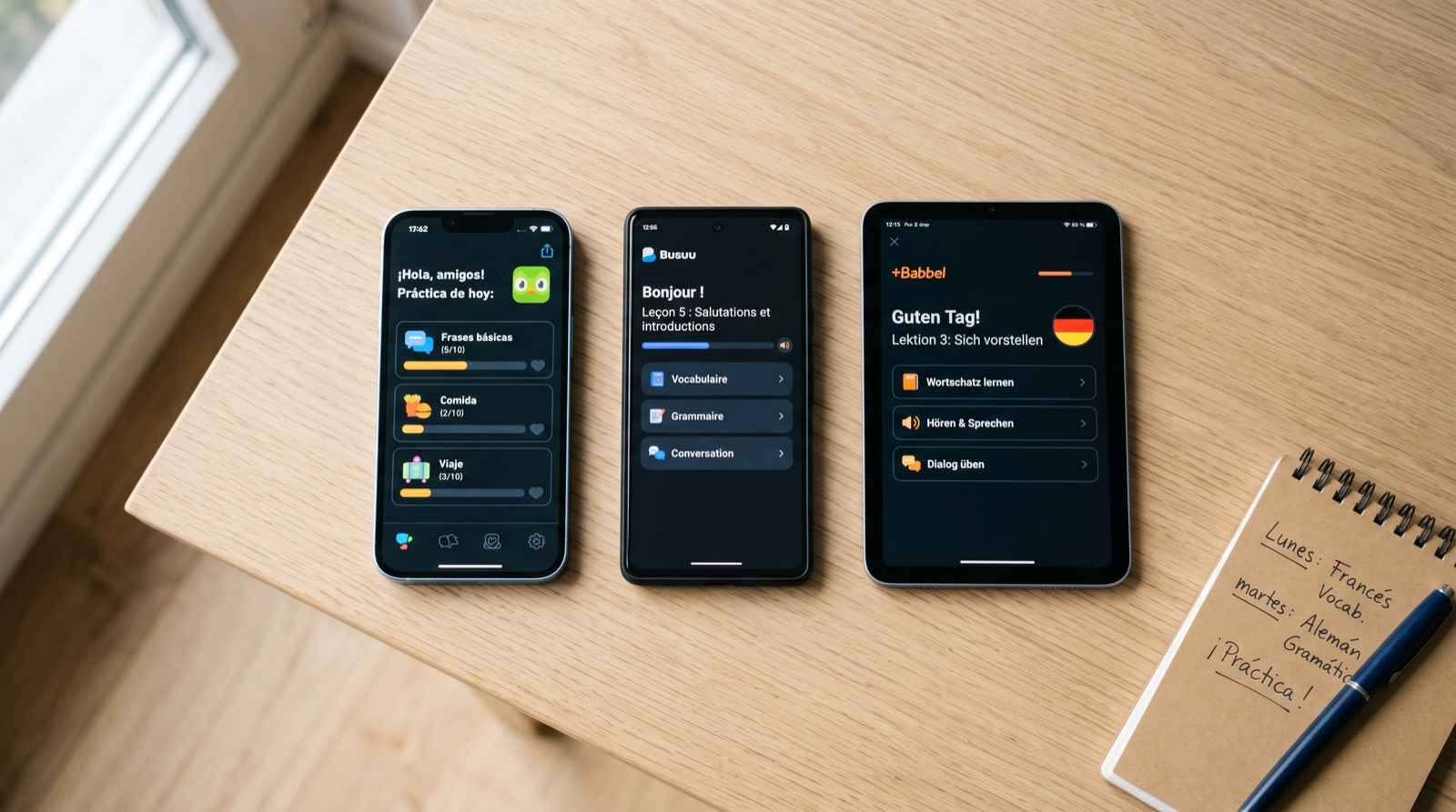
10 best Duolingo alternatives in 2026 (free and paid)
An honest comparison of 10 Duolingo alternatives for 2026. What each app does well, what it doesn't, and which one is right for you.
Ready when you are
Ready to elevate your lexicon?
Download Wordify and start with a 7-day free premium trial. No account, no ads, no rush.